Design and video live in different territories — one is static, the other moves through time. But the principles that make a layout effective are exactly the same ones that make a scene clear, an animation readable, and a motion graphic memorable.
If you learned design before learning to animate, you’re already halfway there. If you came the opposite way, this post is for you.
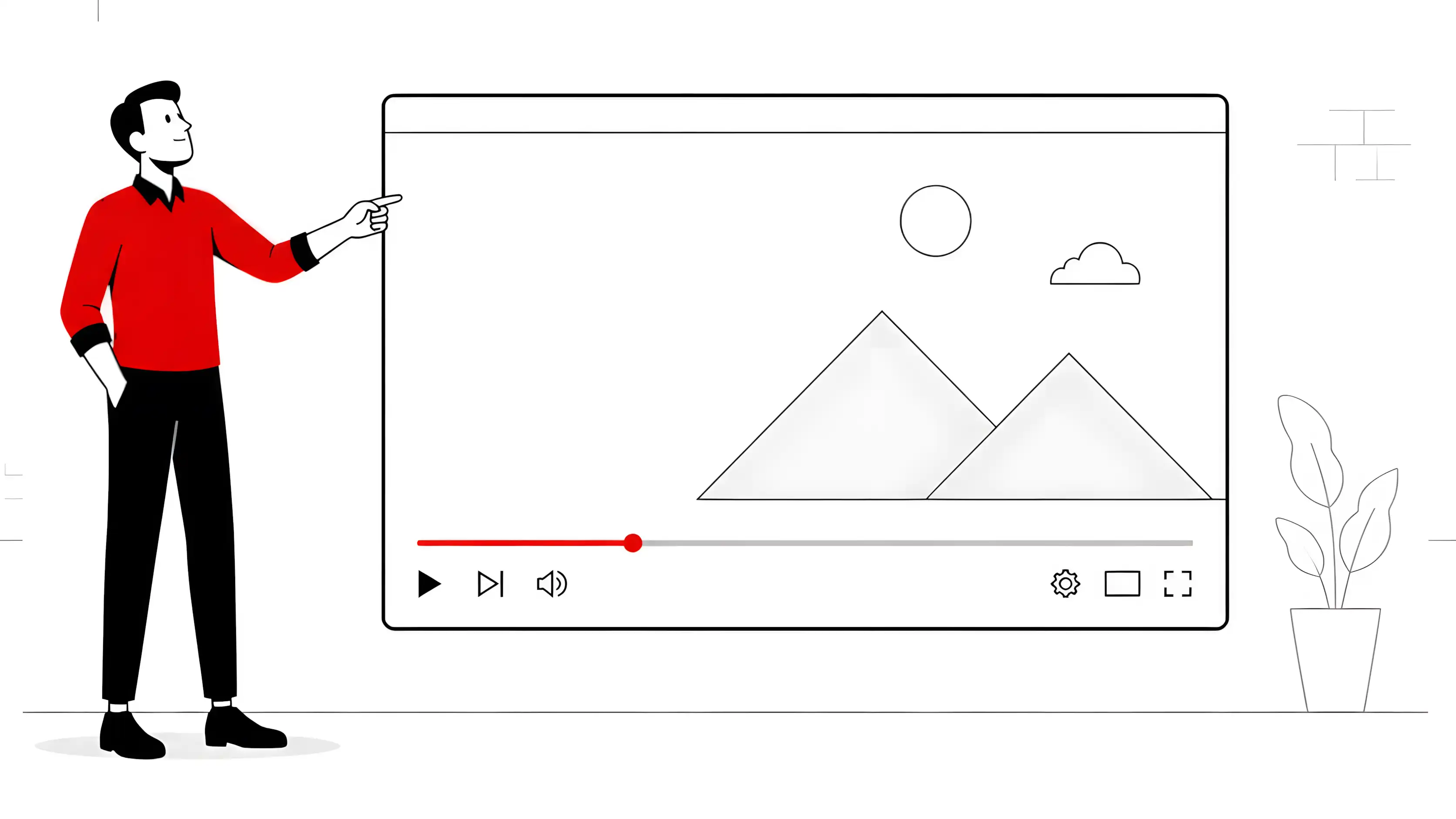
The 9 Principles — and How They Change in Video
1. Repetition
In static design, repetition creates visual consistency among elements within a single piece. In video, it operates over time: the same transition style, the same typeface family for captions, the same logic for how scene elements enter across scenes.
Without repetition, a 2-minute video feels like 5 different pieces glued together. With it, it feels like a cohesive product — even if it has plenty of internal variety.
2. Typography
Lower thirds, subtitles, animated titles — typography in video needs to be readable in motion and at smaller sizes than a designer would normally test. Two practical rules:
- Never use thin serif fonts for videos that will be watched on mobile
- Test your animated text at 50% of the production size before exporting
The typographic choice also communicates personality: geometric fonts convey rationality and technology; humanist fonts convey warmth and accessibility.
3. Space (Breathing Room)
In design, white space gives elements room to breathe. In video, the equivalent is timing: the pause before a text appears, the empty frame between two sequences, the silence in the narration.
Beginner animators often fill every second with movement. Space — both visual and temporal — is where the viewer processes what they just saw.
4. Proximity
Related elements should be close together in the scene. If an icon explains a text, they need to enter together, stay close together, and exit together. When proximity and movement are inconsistent, the viewer’s eye gets lost trying to connect what belongs to what.
5. Color
I’ve covered this in depth in the post about color psychology for motion graphics. The point here is a palette consistent with the brand: each scene can have variations in light and tone, but the structural palette must be recognizable from start to finish.
6. Balance
Harmonious composition of the frame — symmetrical or asymmetrical, both work as long as they are intentional. In video, balance is also dynamic: a moving object can deliberately create tension by breaking the balance, then resolve it when it reaches its final position.
Rule of thirds, leading lines, visual weight of elements — all of this applies frame by frame.
7. Alignment
In motion graphics, alignment is especially critical during transitions: when one element exits and another enters, the alignment line between them creates visual continuity. When it’s missing, the scene looks sloppy even if each individual element is well designed.
8. Hierarchy
What information does the viewer need to absorb first? Second? Third? Visual hierarchy guides that path — through size, color, position, and the timing of element entrance.
In video, hierarchy is also temporal hierarchy: whatever appears first gets more attention. Use this intentionally, especially in the first 5 seconds, which are decisive for retention.
9. Contrast
Contrast highlights what’s most important. In video, it operates across multiple dimensions simultaneously: color contrast, size contrast, speed contrast (a slow element in a fast-moving context draws attention), silence contrast in a dense soundtrack.
Mastering contrast in video is mastering viewer attention.
A Checklist Before Exporting
Before rendering any project, I run through this list mentally:
- Is the palette consistent from start to finish?
- Are the texts readable on mobile and at 50% of the size?
- Is there temporal breathing room between key pieces of information?
- Is the hierarchy clear in the first 5 seconds?
- Do related elements enter, stay, and exit together?
- Do transitions maintain alignment between what exits and what enters?
Six questions. Less than two minutes. They prevent most issues that only show up after delivery.
Free Tools in My Workflow
- Blender — 3D compositing and motion graphics with full camera and lighting control
- Krita — storyboarding and scene composition concepts
- Inkscape — layout for captions and graphic elements before animating
- Kdenlive — final editing, where all principles materialize in the cut
Looking for an explainer video or motion graphic where design and animation work together from the briefing? Contact me.
— Ricardo A. B. Graça · ricolandia.com